Login
By default, this module provides a built-in login page at /login. In addition, the module also provides a few ways below to customize a custom login page in case the built-in login page does not meet your needs.
Using composable
The Auth module provides a composable named useLogin to handle login:
const {
  credentials,
  persistent: rememberMe,
  pending,
  login,
  errorMsg,
} = useLogin({
  credentials: {
    email: '',
    password: '',
  },
  persistent: true,
});
Next, you need a login form, for example a minimal login form as below:
<template>
  <form @submit.prevent="login()">
    <p>{{ errorMsg }}</p>
    <input v-model="credentials.email" type="email" /> <br />
    <input v-model="credentials.password" type="password" /> <br />
    <input v-model="credentials.rememberMe" type="checkbox" /> Remember Me
    <br />
    <button :disabled="pending" type="submit">Login</button>
  </form>
</template>
Where:
credentialsis aref, the initial value is passed through thecredentialsoption of theuseLogincomposable. In this case,credentialsis an object with 2 propertiesemailandpassword, both are empty.loginis a handler function used for login submit.pendingistruewhen calling the login API.errorMsgcontains the error message.persistentis used for the remember login feature, settrueto remember login.
TIP
See more about useLogin in the API > Composables
Using component Authenticator
This module provides a component named Authenticator which is auto imported.
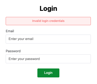
This component provides a simple built-in login form, you just need to pass credentials as an object with 2 properties email and password as below.
// pages/login.vue

<template>
  <Authenticator :credentials="{ email: '', password: '' }" />
</template>
The default login form looks like this:
To disable the default CSS, you can pass css prop with false, then customize the component's CSS yourself.
<Authenticator :css="false" />TIP
See more about Authenticator in the API > Components